Horizontal Attention Heat Map
Nielsen’s group recently published the results from an eye tracking study for user attention for horizontal dimension.
Their main observation is
- Left half of any page gets 69% of viewing time and right half gets about 30%.
- Their recommendation is ‘Stick to the conventional Layout’ for the best results.
- Keep navigation all the way to the left. This is where people look to find a list of current options.
- Keep the main content a bit further in from the left.
- The most important stuff should be showcased between one-third and halfway across the page. This is where users focus their attention the most.
- Keep secondary content to the right.
Brendan Reagan from Grokdotcom came up with his own way to apply that data for testing the page layouts.
Nielsen’s data for viewing time across horizontal dimension by 100 px each is found in the chart below.
![]()
I translated this data into a reusable heat map to be shared with UX team at work and I figured I should share it here as well. You can get the full sized png template here.
When I came across ABtests.com, I looked through the samples uploaded and found this sign up page A/B testing by LessAccounting. Original test write up theorized that having the buttons on the left might be the primary contributing factor to 20% increase in conversion rate. His hypothesis is correct if we can believe Nielsen’s data as correct across all sites with left to right reading languages.
Comparing the sums of attention percentage for each layout, we can clearly see the left layout got much more attention. This test is particularly a good A/B test to support Nielsen’s data since all other elements (content, call to action button color, size) remain exactly the same in both layouts. The only difference here is the position of the call to action buttons and more informational bulleted text.
- If it’s an existing site, resize your browser window to 1100 px before taking a screen shot.
- If it’s a design in progress, you should capture it around 1100 px size.
- Open your image in Photoshop and layer this heat map over.
- Line up the top of the heat map color bars with top of your image so that you can see the percentages clearly. (optional)
- Adjust the opacity till your image is visible.
You can take this template and start layering over landing or new content pages you are designing and optimize your layout to maximize intended conversion metrics.
Recap from Product Camp Boston

Tools and Web Sites Mentioned
Over the web usability testing tool : Userfly
I recommended this web based usability testing tool to a few people citing the virtues : a) easy to set up, b) cheap and c) convenient for remote users. I think the easiest way to see how Userfly works is playing with the demo they put up.Check out their site
Product Innovation Through Playing Games : InnovationGames
This site was recommended by the session leader of Product Innovation Session. It appears to be a collection of interactive techniques/games you play to ultimately define your product’s future vision. The site and concept are based off of the book with the same name.

Book Recommendations
Here are a few more books you can read if you are completely new to this subject and you’d like to get more into it.
- If you just want a quick and easy intro to graphic design, try The Non Designer’s Design Book.
- If you just want to add some visual thinking to your life, try Back of the Napkin.
- If you really want to get into the details, try About Face 3.
At the Innovation session, I mentioned this awesome little book called Why Not? by Barry Nalebuff and Ian Ayres. (Side note: these guys are the guiding forces behind Stickk, another one of my favorite sites.)
If you were at ProductCamp Boston and have anything to add, please let me know in the comments!
12.11.08Post from Cooper Journal: Designing time to think
I selected the part of the original post that I consider more relevant to everyone rather than the latter part which is more relevant to me as an interaction designer.
An insightful post and I should at least attempt to listen to the talk that sparked this blog post. I’m not good with listening to long talks. My attention span isn’t long enough and I have to save time to think!
12.1.08Original source : http://www.cooper.com/journal/2008/12/designing_ti…
Designing time to think
by Emma van Niekerk on December 5, 2008I was busy with production work last week, and in the background I listened to the Google TechTalk by David Levy, “No time to think.” In spite of the title (and my partial attention), it really got me thinking. Levy suggests that we are in an information environmental crisis, that we need silence and sanctuary for creative reflection and engagement. He explains that Nobel Laureate Barbara McKlintock was able to see further and deeper into genetics than anyone had before because she took the time to look and to hear what the material had to say to her. At Harvard, students asked her “where does one get the time to look and think?” They argued that the pace of current research seems to preclude such a contemplative stance.
This is a pressure we can all relate to. I struggle to find the time to think deep thoughts. Every time I try, I interrupt myself to check my email or text messages, or track the latest news headlines. Randall Munroe over at xkcd.com seems to have the same problem. It seems that my attention span is inversely proportional to the number of “productivity” tools and toys I have. As much as I love it, my iPhone has been the worst thing I could have done for my ability to focus.
These days we rarely focus clearly on one thing at a time, multi-tasking from the moment we read the paper on the bus with headphones and coffee en route to work, until we get home and check email in front of the TV while eating dinner. We are constantly interacting with technology devices and information.
Vannevar Bush’s 1945 article, As We May Think, expressed the hope that more powerful tools will automate the routine aspects of information processing, and would thereby leave researchers and other professionals more time for creative thought. But as Levy points out, more than sixty years later, it seems clear that the opposite has happened, that the use of the new technologies has contributed to an accelerated mode of working and living that leaves us less time to think, not more. Levy asks where in our culture we are making time to think, since thinking takes time.
At the end of the talk an interesting comment came from fellow who observed that, in contrast to Sweden, San Francisco has very few public benches where one can just sit down and observe what is. One has to keep moving, and according to the laws if you stay in one place too long, you may be considered to be “loitering.” In our culture, there are few opportunities to be calm and sit down in a public space, unless one is consuming something at a coffee shop or a café. This is something that has been built into the culture and the architecture. We need to rediscover the places that will encourage this kind of thinking and reflection – not only in our physical but also in our digital spaces. Creative thought can’t be rushed, but it can be nurtured.
It’s really important to take the time to look and to think. Let’s think about how we can design metaphorical benches in our products to encourage people to stop and reflect where necessary.
Interaction Designer or Dictator?
I hate ‘speak to me’ phone menus. Numbers and buttons are accurate and FAST. how long does it take to push a button? how long does it take to say ‘check my balance’?
3 more reasons why voice menus don’t work.
1. I have no privacy. I have to say it out LOUD into the phone in the middle of a waiting room at the dentist or in a crowded elevator or even in the middle of the cubicle land. No, I don’t like people knowing what I am doing exactly at this minute.
2. Again, it’s also about noise. I can’t always control the noise level of my surroundings. Sometimes kids are crying or cars are honking or some idiots are revving their engines for no reason.
3. Less offensive to most of you but I am not a native speaker. I have an accent (some find it cute!) but the fact of the matter is I sometimes pronounce certain words in a non American pronunciation. The voice recognition system gets screwed up and it doesn’t know what to do and freaks out. Eventually, they made me speak to a real person. Why can’t I just push some buttons on my phone and be done with it — FASTER, SIMPLER and in a more PRIVATE manner?
The take away is provide options for different types of user to optimize the user experience. The optimal solution is to ask the user if he/she would rather use a touch tone dial system. Not giving the option to opt out of the voice menu system is in a way saying “I, the system designer, know what’s best for you, silly user. I know this is the best option whether you like it or not.”
Dictating how user should interact with your system is just arrogant.
This post is sparked by this blog post from Signal vs. Noise blog.
Link of the moment : Webware – Google revamps Street View interface
http://news.cnet.com/8301-17939_109-10108117-2.html?part=rss&tag=feed&subj=Webware
11.21.08Street View’s split screen, when it’s working.
(Credit: Google)
Tool Box : Balsamiq — post by Perfect Tuna
I tried out this tool after reading Samantha LeVan’s post. It’s super fast and all the alignment just happens. $79 is totally worth the money. I plan to write my own review post on the tool soon.
06.30.08I’m always looking for new ways to sketch and wireframe my GUI ideas, searching for something quicker than hand drawing and less refined than Visio and Illustrator. My rule for the perfect tool is that it has to be super fast to learn and quick to produce results. Googling wireframing tools, I came across Balsamiq’s website. What captured my attention was the fun appearance of the GUI and the statement that “life’s too short for bad software”. That’s a pretty bold statement to make so I had to try this tool out immediately. Super psyched that I could run it on both my work PC and my home Mac, I installed it and had it running within minutes.I fell in love with this software immediately.
Why Balsamic Mockups is fantastic:
- It doesn’t require much learning time. Drag-and-drop interactions are intuitive and consistent.
- Work feels fun. I felt like I was sketching ideas and playing, rather than feeling like tasks are tedious and repetitive. The grunt work is done for me.
- The primary GUI widgets are included. Containers for both web and software applications are included.
- The elements are sketchy. In this I mean my wireframes really do look malleable and editable. It is clear that at this stage, a project can be critiqued and changed easily. This is sometimes hard to communicate with more refined wireframes and mockups. The focus is on the layout, not the visual design.
- Having all the widgets in front of me helped drive me to some creative solutions my first try. Interaction methods I hadn’t considered were sitting right in front of my eyes inspiring innovative solutions.
I believe my biggest reason for supporting Balsamiq’s software is that it feels like a tool designed for users. As a usability analyst, I am a firm believer that software must be designed based on research and this tool feels like a company invested in user research. I see this in the little details – the notebook background that gives a sense of drawing in a sketch pad and the awareness of the common GUI elements that designers are looking for.
Of course, there’s always the one big block to many designers looking for a new application – cost. This one’s really reasonable, just $79. There’s no excuse not to try it as the demo is free. I honestly believe you’ll be hooked if you just try it once.
Posted bySamantha LeVan
Netflix listens.
About 2 weeks ago, Netflix announced they were getting rid of user profiles. They said the reason was to make the site more simple to use for everyone and they observed :
Too many members found the feature difficult to understand and cumbersome
I had my account set up with 2 profiles for a while so that the boyfriend can have his own queue. But we eventually got rid of the 2 profiles and just let him move the movies up and down my queue. I think the reason they said was probably true. The feature was not very usable. But I don’t think you could get rid of a feature many users are actively using just because some users found it difficult to understand. There must be something that Netflix wasn’t being honest about. If it was really the difficulty to use, shouldn’t it be the responsibility of the service to make the feature more usable, more understandable, less cumbersome? Getting rid of a feature people find it hard to use can’t be the right way to go about!
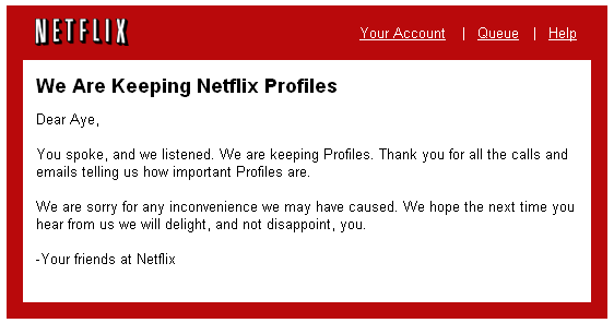
So people complained loudly and Netflix listened and they are keeping the feature. Here is the email I got just now.
Now, I believe it’s on the shoulders of the designers at Netflix to figure out how to make this feature not so hard to use.
06.1.08Call-Your-Kids Search
CreditReport.com screwed my mom over last week – and Google helped them do it.
If you missed the singing dude in the pirate costume, FreeCreditReport.com (and CreditReport.com) make their money by giving you your credit report for free, then signing you up for expensive credit monitoring programs that nobody wants. Why would anyone fork over their money when credit reports are available for free without the scam credit monitoring programs thanks to the U.S. Government? It’s because people get confused, believe these sites are the official credit report site, don’t read the fine print, and hand over their credit card numbers because they think that’s part of the credit report identification process. These sites can only get money if they maintain the deception that they are the official free credit report site. If one of their visitors finds AnnualCreditReport.com, the jig is up.
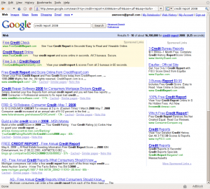
How do these nefarious sites manage to trick people in the age of Google? Well, it’s pretty easy. My mom searched for “Credit Report 2008” with Google, and the picture below is what she got.
See any sign of AnnualCreditReport.com – practically the only site anyone searching for anything having to do with credit reports would want? Me neither. If you search for just “credit report” Google’s algorithms nail it, although it’s still hard to see underneath all the sponsored link clutter. The extra “2008” term kills PageRank, letting the search engine optimizers hijack the search results. CreditReport.com, here we come.
This set of results screams out for somebody to build better credit report search results page than Google’s algorithms. For this particular search, it’s not rocket science. 90% of the time, people searching for “credit report almost anything” want either their free annual credit report or a description of what a credit report is. Approximately 0% of the time, they want to sign up for crappy overpriced credit monitoring. Human-powered search seems like it could be the answer.
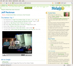
Unfortunately, we’re not there yet. Here’s what Mahalo (the only human-powered search engine I’ve heard of) displays for a search of “credit report.”
Wow, could that be less useful?
OK, they’re working on it, and they don’t have pages for everything yet. Fine. The problem is that the pages they do have won’t help my mom. The Guide Note is nice, but Wikipedia handles that, and my Mom already uses it. More importantly, where are the search results? Surely there are more than 7. Those 7, though, are all you’re getting from Mahalo.
Mahalo’s got exactly the right idea and exactly the wrong idea at the same time. My mom would love a site that uses humans to generate the top results for common searches like this one and outsources the rest of the results and the results for topics it doesn’t cover yet, behind the scenes, to someone like Google. I would love to install it as her home page. But she’s not going to want to watch Mahalo’s compulsory YouTube video or share the page on Facebook. She’s also not going to know what to do when Mahalo returns a Wiki-stub with a spam link or two as search results for something. Mahalo dedicates most of their page space to non-search stuff (scroll down for Web 2.0 overload) and puts stuff like Facebook, StumbleUpon, and Propeller on every page — and I don’t know a single person who knows what Propeller is.
Why is Mahalo targeting young, first-adopter, super-wired people instead of people like my mom? When we’re searching, all the Web 2.0 goodies in the world won’t intrigue us – we want good results fast. And in terms of good results fast, their editors are never going to be able to put together a page that will be able to beat Google for me. I’ve been searching the Internet for 12 years, and I’m as good or better than anyone they can afford to hire to write guide pages for them. Anyone who’s heard of Propeller is probably even better. The people who need human-powered help aren’t people like me, they’re people like my mom.
If Mahalo could get their name out as the site where you send your parents when they want to get a copy of their credit report without getting hit with $75 of nearly-fraudulent charges, they would get dozens and dozens of older eyeballs.
My mom likes to buy crap, and has a reasonable amount of disposable income. If you show her an ad for a porcelain unicorn (something that has 0% chance of confusing her when she’s searching for her credit report, but something she’s searched for before), she just might buy it. And there are a LOT of people over 45 with disposable income who get confused by Google’s search results.
Most of these people don’t understand that all that small print at creditreport.com means “these guys are going to charge me every month if I take them up on the ‘free credit report’ offer.” And a lot of them might throw in a “2008” at the end of their searches. I don’t think PageRank is going to be able to stay ahead of the search engine optimization people in cases like these.
Mahalo can. They need to be targeting people like my mom.
Right now, Google won’t pay the price for raking in their share of the spoils creditreport.com got from screwing over my mom. My mom is in the demographic of people who blame themselves whenever something goes wrong and a computer is involved. She won’t blame Google (like I do), and nobody else is any better anyway. cRANKy, the search engine targeting people over 50, is way too terrible to recommend.
For now, my mom will fight with CreditReport.com’s customer service, then initiate a chargeback with her credit card company. Next time she needs something like this, she will call me and feel ashamed that she can’t handle something that sounds so simple on her own. And until someone makes a better search for older people, call-your-kids search will be the answer. Just like it was in 1998.
05.12.08Algorithm to generate tag clouds
I was talking to a friend who’s trying to figure out a formula for generating tag cloud. The purpose of a tag cloud is to convey the extent of relevance of a tag among all other tags being used. Trying to display the frequency of tags sounds easy but there are different issues for different algorithms out there. ( the ones found by quick google search)
The first one is from WordPress Codex. The summary for the algorithm is they sort the tags by frequencies and then group them into each font size. The problem with this algorithm is if the max frequency is 5000 and the second to max frequency is 50. They will be displayed in the same font size since the algorithm does not take the frequency range into account. Also when frequency range is too narrow, a tag with 24 occurrences and a tag with 25 occurrences may just have different font sizes if the cut off happens to be between 24 and 25.
The second algorithm we found is this one. This one takes the frequency range into account but it tries to display tags in font sizes that only differ by 1 unit each. The problem here is human eye’s inability to detect varying font sizes if there are too many steps between the max font and the min font. So 100 different tags with sizes ranging from 10px to 48 px will not be visually distinguishable.
I figure if we take the second algorithm and modify it so that font size gap is big enough to be visible, it may just work.
count the frequencies for all tags
find min freq and max freq
x =Â freq of tag we want to calculate the font size
scaling factor, K = (x – min freq) / (max freq – min freq)
font range = max font size – min font size
font step = CÂ (the constant font step size)
font for tag =   min font size + (C * floor (K * (font range/ C)))
so if we reuse the example from the second algorithm
min freq = 6 , max freq = 91, freq for current tag = x
scaling factor K = (x – 6)/85
min font = 10 , max font = 30, font step = 4
font for tag = 10 + ( 4 * floor (( (x-6)/85) *( 20/4)))
so if x = 64, font for tag = 22
if x = 79, font for tag =Â 26
if x = 14, font for tag = 10
if x = 32, font for tag =14
Although it does not solve the problem of the max frequency so far off from the rest, it will pile more tags with lower frequencies into smaller font sizes. But a spike can be handled as a special edge case. this will work for most cases as long as the distribution curve is not too far off from the bell curve.
I need to look into another algorithm that takes median or mean with standard deviation as a way to generate banding. But it again won’t work since we are still assuming the distribution curve to be bell shaped.
I need to keep thinking about how we can display tag clouds with frequencies with a distribution curve that doesn’t fit bell shaped. It’d be nice to get real data of tag occurrences from live sources like flickr, youtube, digg etc.
05.4.08Trulia Hindsight : Time lapsed map of residential development
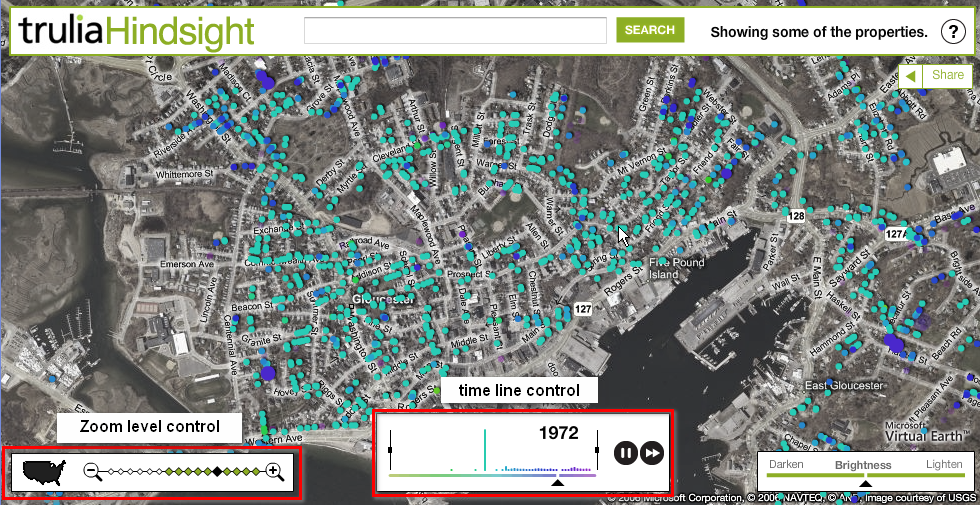
Trulia has this tool called Hindsight that lets you enter an address and watch how that area develops over time since 1800s. http://hindsight.trulia.com/map/#lat=42.464&lon=-71.074&zoom=14&mix=0.500
Things I like about the time line control
1. They match the time on the time line with the dots on the map by color.
2. You can pause, resume and fast forward
3. You can limit the duration of the time line by dragging the boundaries
Things I would change
1. I wish they won’t make it play in a loop by default. I just want it to play it once and stop at the end of the first pass. So I actually have time to analyze what I am seeing.
2. Since they have the data for each node on the map, why can’t I hover/click on each node to get more details?
3. Color choices don’t really work for me. They seem too blended in and there is no culturally associated meaning of going from green to purple.
Google Finance also has a similar draggable boundary time line control. But it’s not a time lapsed display of events.


