Netflix listens.
About 2 weeks ago, Netflix announced they were getting rid of user profiles. They said the reason was to make the site more simple to use for everyone and they observed :
Too many members found the feature difficult to understand and cumbersome
I had my account set up with 2 profiles for a while so that the boyfriend can have his own queue. But we eventually got rid of the 2 profiles and just let him move the movies up and down my queue. I think the reason they said was probably true. The feature was not very usable. But I don’t think you could get rid of a feature many users are actively using just because some users found it difficult to understand. There must be something that Netflix wasn’t being honest about. If it was really the difficulty to use, shouldn’t it be the responsibility of the service to make the feature more usable, more understandable, less cumbersome? Getting rid of a feature people find it hard to use can’t be the right way to go about!
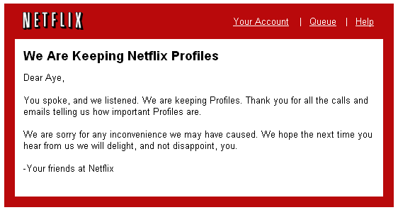
So people complained loudly and Netflix listened and they are keeping the feature. Here is the email I got just now.
Now, I believe it’s on the shoulders of the designers at Netflix to figure out how to make this feature not so hard to use.
05.12.08Algorithm to generate tag clouds
I was talking to a friend who’s trying to figure out a formula for generating tag cloud. The purpose of a tag cloud is to convey the extent of relevance of a tag among all other tags being used. Trying to display the frequency of tags sounds easy but there are different issues for different algorithms out there. ( the ones found by quick google search)
The first one is from WordPress Codex. The summary for the algorithm is they sort the tags by frequencies and then group them into each font size. The problem with this algorithm is if the max frequency is 5000 and the second to max frequency is 50. They will be displayed in the same font size since the algorithm does not take the frequency range into account. Also when frequency range is too narrow, a tag with 24 occurrences and a tag with 25 occurrences may just have different font sizes if the cut off happens to be between 24 and 25.
The second algorithm we found is this one. This one takes the frequency range into account but it tries to display tags in font sizes that only differ by 1 unit each. The problem here is human eye’s inability to detect varying font sizes if there are too many steps between the max font and the min font. So 100 different tags with sizes ranging from 10px to 48 px will not be visually distinguishable.
I figure if we take the second algorithm and modify it so that font size gap is big enough to be visible, it may just work.
count the frequencies for all tags
find min freq and max freq
x =Â freq of tag we want to calculate the font size
scaling factor, K = (x – min freq) / (max freq – min freq)
font range = max font size – min font size
font step = CÂ (the constant font step size)
font for tag =   min font size + (C * floor (K * (font range/ C)))
so if we reuse the example from the second algorithm
min freq = 6 , max freq = 91, freq for current tag = x
scaling factor K = (x – 6)/85
min font = 10 , max font = 30, font step = 4
font for tag = 10 + ( 4 * floor (( (x-6)/85) *( 20/4)))
so if x = 64, font for tag = 22
if x = 79, font for tag =Â 26
if x = 14, font for tag = 10
if x = 32, font for tag =14
Although it does not solve the problem of the max frequency so far off from the rest, it will pile more tags with lower frequencies into smaller font sizes. But a spike can be handled as a special edge case. this will work for most cases as long as the distribution curve is not too far off from the bell curve.
I need to look into another algorithm that takes median or mean with standard deviation as a way to generate banding. But it again won’t work since we are still assuming the distribution curve to be bell shaped.
I need to keep thinking about how we can display tag clouds with frequencies with a distribution curve that doesn’t fit bell shaped. It’d be nice to get real data of tag occurrences from live sources like flickr, youtube, digg etc.
05.4.08Trulia Hindsight : Time lapsed map of residential development
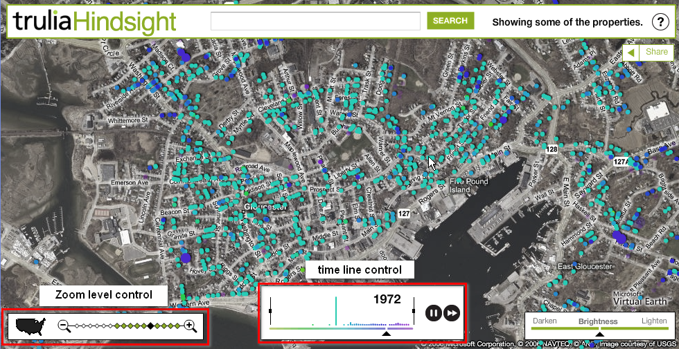
Trulia has this tool called Hindsight that lets you enter an address and watch how that area develops over time since 1800s. http://hindsight.trulia.com/map/#lat=42.464&lon=-71.074&zoom=14&mix=0.500
Things I like about the time line control
1. They match the time on the time line with the dots on the map by color.
2. You can pause, resume and fast forward
3. You can limit the duration of the time line by dragging the boundaries
Things I would change
1. I wish they won’t make it play in a loop by default. I just want it to play it once and stop at the end of the first pass. So I actually have time to analyze what I am seeing.
2. Since they have the data for each node on the map, why can’t I hover/click on each node to get more details?
3. Color choices don’t really work for me. They seem too blended in and there is no culturally associated meaning of going from green to purple.
Google Finance also has a similar draggable boundary time line control. But it’s not a time lapsed display of events.


| Posted in UI | 3 Comments »